Can optical alignment be automated?
Surprisingly, I believe that the answer is yes for many cases. And I have created a Sketch plugin to do so.
Optical alignment is a crucial concept in the design of graphic elements. Its basic idea is that objects should not be arranged using our logical intuition. Instead, they should be aligned in the most perceptually balanced and pleasing way.
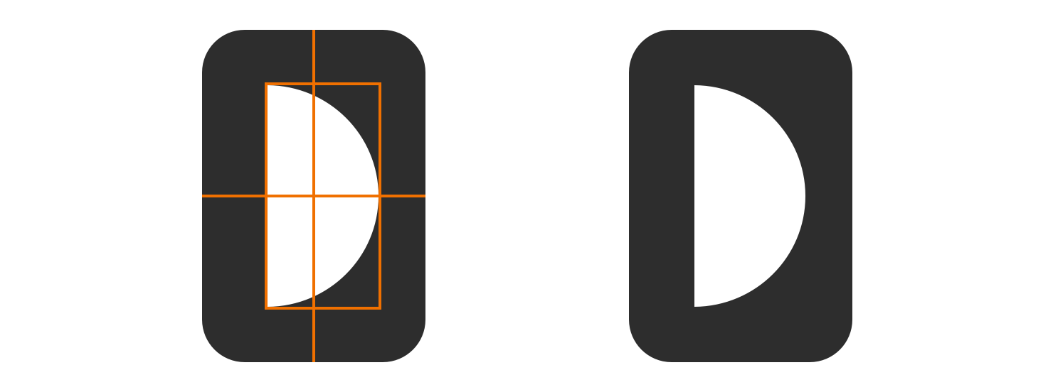
One great example of that is found in the task of centering a semicircle inside a rectangle. It seems obvious to center the shape using the middle of its bounding box, but it simply does not work in this case.

Because the visual weight of the semicircle is mostly on its left side, we should visually adjust it a little bit to the right to make it look centered and balanced.

I asked myself how big exactly should be that little adjustement to the right. Turns out that a lot of times when we want to align objects based on their visual weight, what we actually want is to arrange them according to their centers of mass. So I created a Sketch plugin that does that, and that is how I centered this semicircle.
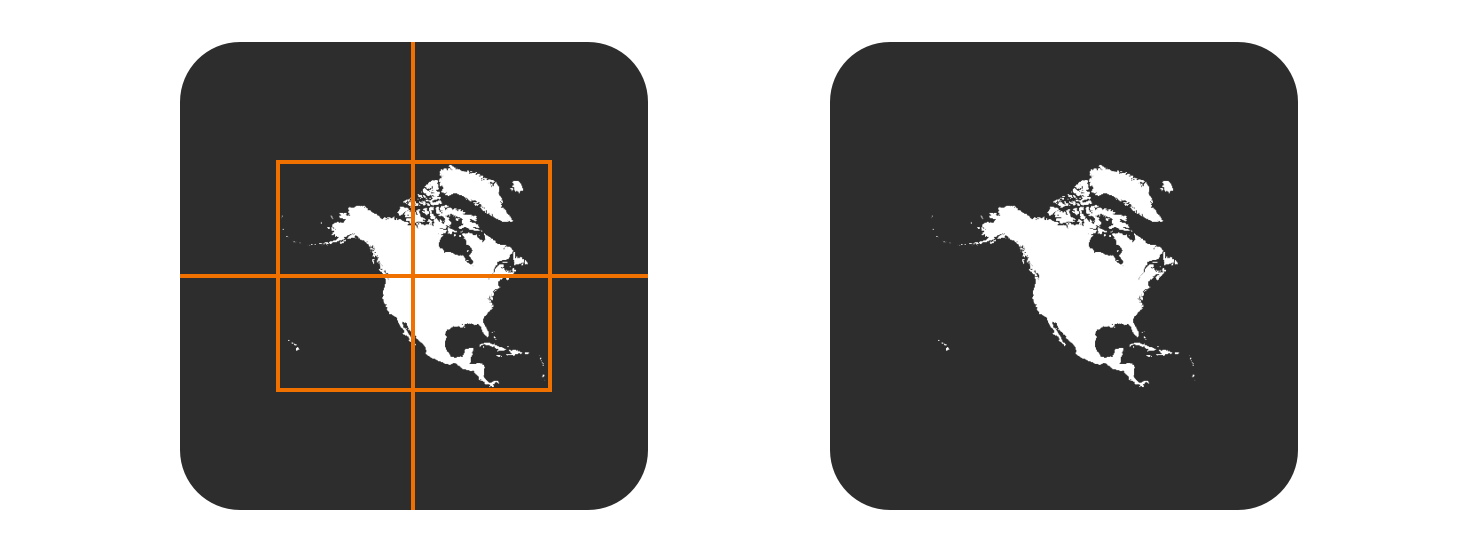
Another case in which this center of mass (also called centroid) idea can be applied is in the centering of this North/Central America map in a frame. Placing the center of the map’s bounding box on the center of the frame seems really uneven.

Because the bounding box does not take in consideration the visual weight of the image, light weighted elements like small islands on the map have a big impact on the box size. For this reason, the final placement looks off-center.
Unlike the bounding box method, the centroid approach gives little importance to light weighted elements. So, aligning the map using the center of mass results in a surprisingly good looking placement.

Even though in the examples above the centroid method gives a great result, that is not always the case. The visual adjustment process can be hard and subjective, with many variables that influence how we perceive things as balanced, aligned or simply good looking.
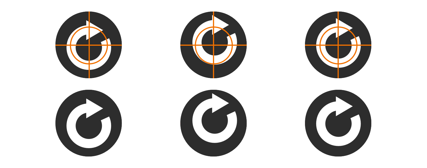
For example, if we try to center a circular arrow inside a circle. It becomes clear that both the bounding box (left) and the centroid (center) approaches are not good solutions. To achieve the best result we should align the arrow as it were its core shape, which is a circle in this case (right).

Although the center of mass alignment is not always the best option, many times it is. Furthermore, even in cases in which there are no clear solutions right away, this method can provide great insight and serve as a base for further adjustments.
That is why I created Magic Aligner, a free and open source Sketch plugin that can automatically adjust objects using their centers of mass. Make sure to try it out and test it with different shapes. Chances are, this tool can be as useful to you as it is to me.
