From Playground to App

June 1, 2021

For this year’s WWDC Swift Student Challenge, I created a 3-level game called Aeronaut. After I submitted my playground to Apple’s contest, I decided to extend Aeronaut to a full-featured game with 36 levels and hours of gameplay. Today, I was humbled to receive the news that my playground was selected by Apple. Moreover, I have just released the extended version of Aeronaut on the App Store.


I usually try to embed some kind of implicit educational value into my games and Aeronaut is no exception. The idea for the game came from a misconception I had for a long time. I thought that hot-air balloons could only go up or down with no steering capability at all, but I recently discovered that balloonists take advantage of wind currents in different altitudes to steer the balloon where they intend to go. I found it fascinating and started to build a game around this concept.

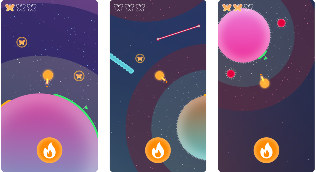
Aeronaut is a one-button game in which players guide a hot-air balloon through outer space. In its carefully designed levels, users will find colorful planets, bouncy obstacles, deadly hazards and collectibles that create a fun and exciting experience.

Inspired by real hot-air balloons, the only button of the game activates the balloon burner. When the burner is on, the aircraft goes up. When the burner is turned off, the balloon descends. The challenge is to fly the balloon to a landing pad by using the wind currents, rather than explicitly controlling the direction of movement.

I had a lot of fun and learned so much while making this game. I hope you find it fun as well! You can download Aeronaut for free on the App Store and play its first pack of 6 levels free of charge. Players can unlock all level packs and be able to enjoy all 36 levels of the game with a small one-time in-app purchase.

Announcing Controlly

February 8, 2021

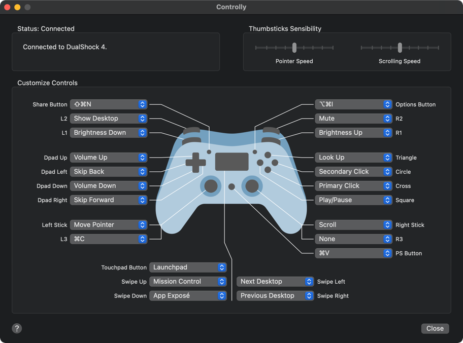
Recently, I started to keep a game controller next to my computer for the rare occasions I want to play a game. But, sometimes, when watching a video or reading a document, I caught myself picking the controller to press its buttons for some distraction. During one of those moments, I realized I wanted to use the game controller as a remote control for the Mac in order to control playback, volume, scrolling and more. Today, I am happy to launch my latest app: Controlly.


As someone who suffers from computer-related RSI, I am very interested in alternative ways to interact with the Mac. That’s why I created the app El Trackpad a few months ago. This app basically transforms the iPhone or iPad into a Magic Trackpad, with great support for system gestures like opening Mission Control, App Exposé, Launchpad and more. It was clear to me that I would love the ability to trigger these actions with the game controller as well.

So, I started a search for apps that could turn a game controller into a remote control for Mac. Unfortunately, the closest thing I found were key mapping tools. They allow users to map each button on the controller to one letter or number key. That is good for gaming, but not enough for a general purpose controller for the Mac.

Besides that, these key mapping tools do not support keyboard shortcuts and their user interface could be more visual in my opinion. One of them even supports mouse movement and scrolling, which is nice. But, the acceleration of the pointer did not feel right and I found it very hard to move the pointer to where I wanted it to go.

At this point, I felt I had to develop the app I wanted to use and the set of features I had in mind was very clear. I wanted a very visual user interface, nicely tuned mouse actions, ability to set custom keyboard shortcuts and trigger system conveniences like Mission Control, App Exposé, etc. Also, I still wanted to control playback, volume and a few other extra functions if possible.

After a few weeks of development and a lot of help from friends who tested the app and gave me invaluable feedback, I am pleased to announce that Controlly is now available on the Mac App Store. I hope it can be as useful to others as it is to me.

Can optical alignment be automated?

November 29, 2019

Surprisingly, I believe that the answer is yes for many cases. And I have created a Sketch plugin to do so.

Optical alignment is a crucial concept in the design of graphic elements. Its basic idea is that objects should not be arranged using our logical intuition. Instead, they should be aligned in the most perceptually balanced and pleasing way.

One great example of that is found in the task of centering a semicircle inside a rectangle. It seems obvious to center the shape using the middle of its bounding box, but it simply does not work in this case.

Because the visual weight of the semicircle is mostly on its left side, we should visually adjust it a little bit to the right to make it look centered and balanced.

I asked myself how big exactly should be that little adjustement to the right. Turns out that a lot of times when we want to align objects based on their visual weight, what we actually want is to arrange them according to their centers of mass. So I created a Sketch plugin that does that, and that is how I centered this semicircle.

Another case in which this center of mass (also called centroid) idea can be applied is in the centering of this North/Central America map in a frame. Placing the center of the map’s bounding box on the center of the frame seems really uneven.

Because the bounding box does not take in consideration the visual weight of the image, light weighted elements like small islands on the map have a big impact on the box size. For this reason, the final placement looks off-center.

Unlike the bounding box method, the centroid approach gives little importance to light weighted elements. So, aligning the map using the center of mass results in a surprisingly good looking placement.

Even though in the examples above the centroid method gives a great result, that is not always the case. The visual adjustment process can be hard and subjective, with many variables that influence how we perceive things as balanced, aligned or simply good looking.

For example, if we try to center a circular arrow inside a circle. It becomes clear that both the bounding box (left) and the centroid (center) approaches are not good solutions. To achieve the best result we should align the arrow as it were its core shape, which is a circle in this case (right).

Although the center of mass alignment is not always the best option, many times it is. Furthermore, even in cases in which there are no clear solutions right away, this method can provide great insight and serve as a base for further adjustments.

That is why I created Magic Aligner, a free and open source Sketch plugin that can automatically adjust objects using their centers of mass. Make sure to try it out and test it with different shapes. Chances are, this tool can be as useful to you as it is to me.